
Working with a brand this recognisable means the interface has to feel like the brand before it feels like an app. The design leans on Wendy’s red, its typography and its famously direct tone of voice, while keeping the ordering path short enough to finish one-handed.
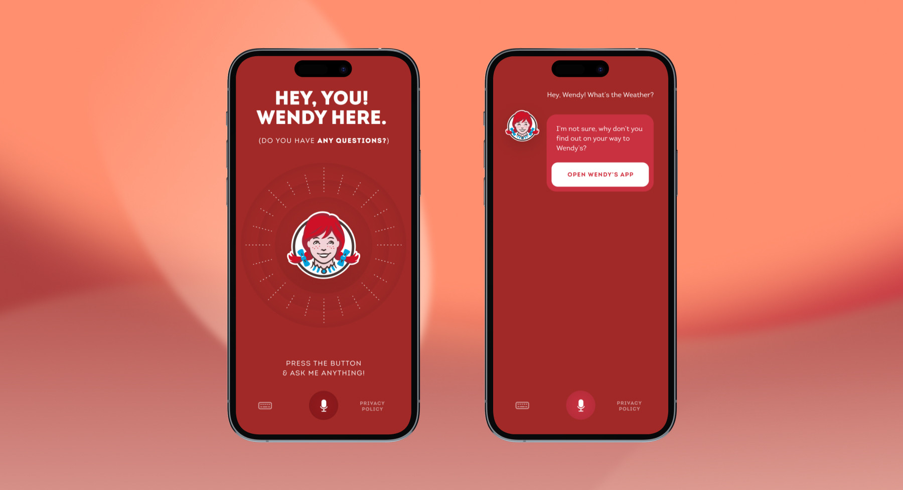
A mobile experience for one of the world’s best-known quick-service brands — ordering, offers and loyalty, wrapped in an unmistakable brand voice.
Interface built around an established, highly recognisable identity.
A short, one-handed path from craving to checkout.
Promotions and rewards surfaced without cluttering the menu.
Whether it’s a new product or a team to scale an existing one — get a senior perspective within one business day.